I have previously shared articles by Carl Richards, author of The Behavior Gap. We always have copies available if you would like to give it a read.
Recently, Carl released an article called Market forecasting isn’t like the weather.
Carl is famous for his napkin sketches. Each sketch illustrates a simple idea about investing. Here is the image from that article. You can't get a more simplified explanation of what markets deliver for investors.
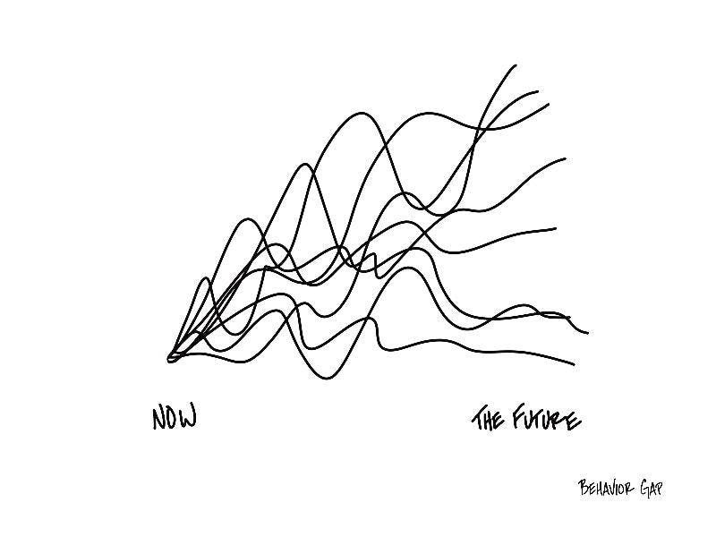
Carl uses this sketch to describe how difficult it is to guess where the market is going. The chart instead reminded me of this article I wrote way back in 2019. To sum up, even a long period with average returns may include big ups and big downs. While we would prefer to have our portfolios grow in a straight line, market declines are nearly as common as rises.
We have just been through many years just like this, with COVID, Ukraine, Evergrande, and now inflation and interest rate rises. However, economies also boomed as we left the worst of the pandemic behind us.
When making projections, we often use only the expected return to estimate how our portfolios will grow. Over four years ending December 2022, globally diversified shares delivered a healthy return of 9.4% p.a. Here is what that looks like using the performance of the Dimensional Global Core Equity Trust NZD Hedged.

In reality, these four years included a 26% drop in 2020 and a 21% drop in 2022. Although the overall return was about average for shares, the road was very bumpy. Here is the outcome we actually experienced.

With hindsight, we understand the importance of staying patient during times like this. Living through it is another story. It was scary watching how share prices plummeted during early 2020. Nobody would have guessed prices would be out of the red by the end of the year.
It is also important to note that markets always behave like this. While we can make our best predictions using statistical models, they only represent an average of all outcomes. An actual "average" period for shares looks like that blue line above.
The takeaway here is that models are useful for long-term planning, but actual markets bunny-hop along like stalling engines. Don't be dissuaded by backwards steps along the way. A long-term view puts these bumps in perspective.